

Darling, this article was written back in early 2019, but I wanted to revive it as I know now with COVID-19, painting and redecorating are very popular. So, let’s talk all about how to pick the right paint color for your home!
Picking the right paint color for a room can be tricky. Many people have a hard time choosing the right paint colors. Sure, you can scoop up dozens of samples but in reality, this is a costly venture. The cost of one pint of paint to test on your walls will run you $7. Multiply that by four more because you’re not sure if you like “Iced Lavender” or “Iced Plum” and what you have is a frustrated husband and about $30 down the drain.
Instead of letting the process become stressful, try to make choosing paint colors more fun and creative. Exploring different shades can be an enjoyable way to express your personality and style.
What’s a gal to do? Follow these 10 tips before you make the purchase and I promise decision-time will come that much easier—you need all the help you can get when making these choices!
Paint Colors
Choosing paint colors for your home can feel like a big decision, but it’s also one of the most exciting ways to transform your space. The right paint color can add warmth to a chilly room, create a sense of calm in a busy area, or even make a small space feel much larger. Choosing the right color for each room is essential to ensure the space feels inviting and suits your needs. Whether you’re painting one wall as a statement or refreshing the entire house, understanding how different hues work together is key. Selecting the right paint colour or a great color palette can help you achieve a cohesive and calming home atmosphere that complements your interior finishes. From timeless neutrals like beige and gray to bold choices like blue and green, each shade brings its own personality to your home. With a few simple tips, you can select paint colours that not only look beautiful but also create the mood and style you want. So, let’s dive in and discover how the perfect paint color can help you create a space you truly love—and how finding a great color can make your home both beautiful and harmonious!
Experiment in a Small Space
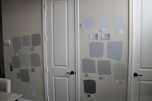
If paint is new territory for you, pick a powder room and test your palette there. Find your confidence levels in a smaller room before you decide to paint your bedroom “Chinese Red!”
Decide on a Mood
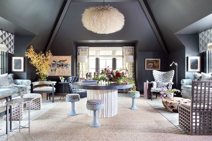
Are you feeling dark and stormy or light and airy? Evaluate the uses for the room you want to paint and choose your hue accordingly. For spaces like bedrooms or studies, consider selecting colors that promote rest and relaxation, such as soft blues or gentle neutrals. Soft pink shades can also be a calming or playful choice for bedrooms or living spaces, depending on the mood you want to create.
Take Note of Your Lighting
Does the room you’re redoing get a lot of sunshine? If the answer is no, stay away from dark colors as it will shrink your room immediately. If your kitchen is flooded with morning light, choose a cheery yellow or mint to offset your gorgeous cabinetry. The placement and trim of windows also play a significant role in how paint colors appear, as well as in creating a cohesive aesthetic—matching window trim to wall colors can enhance the overall harmony and lighting effects in the room. For the best results, paint all the trim and mullions the same color to create a cohesive and unified interior design, ensuring architectural harmony throughout the space.
Understanding Color Undertones
When it comes to picking the right paint color, understanding undertones is a game-changer. Every paint color, whether it’s a soft neutral or a bold statement shade, has an underlying hue—called an undertone—that can make a big difference in how it looks on your walls. For example, a gray paint might have blue undertones, giving your space a cool, modern vibe, while another gray could lean toward yellow, adding a touch of warmth. This is especially important when choosing whites and neutrals, as the wrong undertone can clash with your furniture or decor. Brands like Sherwin Williams and Benjamin Moore offer a wide range of paint colors with different undertones, so you can find the right paint to match your furnishings and create a harmonious look. Before you commit, always compare color samples in your space and see how the undertones interact with your lighting and decor. That way, you’ll end up with a paint color that truly enhances your home.
Educate Yourself on Color
What’s a hue? What’s a value? Should I care about intensity? The answer is yes!
The hue is the color. The value is how light or dark a hue is. And the intensity refers to the brilliance of a hue. Is it super-saturated or more muted? Tones are created by adding gray to a color, resulting in variations within the same color family. Layering different tones can enhance a room’s design by creating depth and a cohesive, inviting atmosphere.
Creating a Color Hierarchy
When choosing paint colors for your entire house, it’s helpful to think in terms of a color hierarchy. This simply means deciding which paint color will take center stage as your dominant hue, and which shades will play supporting roles as accents. Start by selecting a primary paint color that you love and that works well in the rooms where you spend the most time. This could be a soft neutral that flows from your living room into your hallway, or a bold color that sets the tone for your home’s personality.
Next, consider how natural light affects each room. For example, a sun-drenched living room can handle a deeper, richer paint color, while a north-facing bedroom might benefit from a lighter, brighter shade to keep things feeling airy. Use secondary colors for accent walls, trim, or smaller spaces to add warmth and interest without overwhelming the entire house. By layering neutral colors with pops of bolder hues, you’ll create a cohesive look that feels intentional and inviting. Remember, a well-planned color hierarchy helps every room feel connected, while still allowing each space to shine in its own way.
Test it Out
Don’t be afraid to go bold but test out your hue on several different walls. Paint a patch near a window, in a dark corner, next to a dresser. Observe how the painted patches look throughout the day before making a final decision. Make sure you love the color no matter what the lighting is. And if you’re really bold – paint the ceiling!
Add Dimension
Explore texture and finishes. Layers and reflective finishes like metals and minerals can add depth to an otherwise ordinary TV room. Incorporating wood finishes is another effective way to introduce warmth and a cozy atmosphere, while also complementing your chosen paint colors.
Consider the Flow
Walk-in and out of rooms. Is there a cohesiveness between spaces? Using a neutral color throughout your home can act as a unifying element, seamlessly connecting different areas. For a smooth transition, consider choosing colors within the same color family, but a few shades lighter or darker, between connected rooms. You can also use the same color on walls and trim, or across multiple rooms, to create a unified and visually harmonious look. Selecting the right colors for each room and transition area is key to achieving a harmonious and visually appealing home. Similar to art composition, determine how you feel when you can see that bold hue from your kitchen or bathroom.
Choose Complementary Colors
The color wheel says that opposites attract – so listen! Cool, warm, you name it… colors belong to a family. See what I mean here.
To create a cohesive palette, try to pull colors from artwork, rugs, or other inspiration pieces in your space to guide your paint color choices. When you choose colors, be sure to do so carefully to ensure they harmonize with your existing decor and create the desired effect.
Go Monochromatic
If your comfort zone is in the neutral family, opt for contrasting neutrals such as taupe and gray. When working with a monochromatic scheme, experiment with different shades and tones within the same color family to add depth and visual interest. It’s important to select the right shade to match the room’s style and atmosphere, as the right shade can enhance both modern and traditional decor. Remember that paint often contains more than one color or undertone, which can affect how it appears in different lighting conditions. Or, graduate color… you can select a warm red which could lead into a cooler blue sitting room, for example. The dining room is an ideal space to try bolder or contrasting colors for added visual interest.
Considering Neutral Colors
Neutral paint colors are a timeless choice for painting your entire house, offering a versatile foundation that works with any style of decor. Shades like beige, gray, and soft white are especially popular because they reflect natural light beautifully, making rooms feel open and bright. When choosing a neutral paint color, think about the mood you want to create—warm neutrals like creamy beige can add coziness to a living room, while cool grays bring a sense of calm to bedrooms or bathrooms.
Neutrals are also incredibly flexible, allowing you to easily switch up your decor with colorful furniture, rugs, or artwork. For example, a light gray wall color can serve as the perfect backdrop for bold furnishings or vibrant accessories, while a warm beige can make a space feel welcoming and comfortable. Painting with neutral colors throughout your house helps create a cohesive look, tying different rooms together and making your home feel harmonious. Plus, neutrals never go out of style, so you can enjoy your freshly painted spaces for years to come.
Selecting Trim and Accent Colors
Trim and accent colors are the secret ingredients that can take your room from ordinary to extraordinary. When choosing trim colors, think about the overall look you want to achieve. For example, if you have a dark blue wall color, pairing it with crisp white or a lighter shade of gray trim can create a striking contrast and a cohesive look. On the flip side, if your walls are light, a deeper trim color can add depth and sophistication. Neutral colors like white, gray, or even a soft beige are classic choices for trim, helping to tie the whole space together. Don’t forget about accent colors! A pop of yellow or a bold blue on one wall or in your accessories can add personality and visual interest. By thoughtfully selecting trim and accent colors, you’ll create a space that feels balanced, inviting, and uniquely yours.
Try a Different Paint Finish
Eggshell refers to a matte finish. Generally, walls utilize the eggshell finish. Use satin or semigloss on trim, which is more reflective. For added interest, consider painting or using a stained finish on cabinets to create a focal point or to complement the room’s overall design.
Finding Inspiration from Nature
If you’re searching for the perfect paint colors, look no further than the great outdoors! Nature is full of beautiful hues that can inspire your home’s color palette. Think about the calming greens of trees, the earthy browns and tans of rocks and soil, or the soothing blues and grays of the sky and water. These natural tones can bring a sense of tranquility and warmth to your rooms.
For example, if you have a dining room with a red brick fireplace, consider pairing it with earthy paint colors like olive green or warm taupe to create a cozy, inviting atmosphere. Or, if you love the brightness of spring, try incorporating fresh greens or soft yellows to add energy and light to your space. Drawing inspiration from the changing seasons can also help you choose paint colors that feel right year-round—warm, rich tones for autumn, cool blues for winter, and bright, cheerful shades for summer. By bringing the colors of nature indoors, you’ll create a home that feels balanced, welcoming, and uniquely yours.
Working with a Professional
If you’re feeling overwhelmed by the process of choosing paint colors for your entire house, don’t hesitate to call in a professional. A color consultant or interior designer can offer expert advice on selecting the right paint colors to match your style, furnishings, and the unique features of your home. They’ll help you navigate tricky decisions, like finding the perfect shade of gray to complement your Sherwin Williams palette, or choosing a trim color that ties your rooms together for a cohesive look.
Professionals can also help you consider important details, such as how your paint color will interact with your cabinets, furniture, and even the amount of natural light in each room. For example, they might suggest a soft gray for your living room walls that enhances your existing furnishings, or recommend a bold accent color to highlight architectural features. With their guidance, you’ll feel confident that your paint choices will not only look beautiful but also function well in real life. Working with a professional is a smart investment if you want to create a harmonious, stylish home without the stress of second-guessing every color decision.
Common Mistakes to Avoid
Even the most stylish spaces can fall flat if you make a few common mistakes when choosing paint colors. One of the biggest pitfalls is skipping the step of testing paint samples in your room—what looks perfect in the store might turn into the wrong color once it’s on your walls. Natural light plays a huge role in how a paint color appears, so always check your samples at different times of day. Use common sense when choosing paint colors by considering your neighborhood, existing finishes, and the overall character of your home to avoid obvious mismatches. Another mistake is ignoring your existing furniture and decor; the right paint should complement, not compete with, your favorite pieces. And don’t forget to consider the overall flow of your home—choosing paint colors that clash from room to room can disrupt the harmony of your space. Take your time, test your options, and don’t be afraid to ask for help if you need it. If you do make a mistake, remember that you can always fix paint color errors or imperfections to ensure your home still looks its best. With a little planning and the right paint, you’ll create a home that’s both beautiful and a true reflection of your style.
Which Colors Are Inspiring You Right Now? Let us know at the comments at the bottom of this page.
We’d love to see your inspiring color choices! Share a photo of your favorite painted room in the comments below.
For more tips and inspiration on choosing paint colors, check out our related blog post. Use our blog as a reference for research and inspiration when selecting paint colors and finishes for your home.
I am using a gray taupe in my living/dining room; a gray green in one bedroom and a gray blue in the other bedroom. With the undertone of gray, it blends with the carpet and hardwood, yet gives each room a bit of distinction.
There is continuity throughout your home. I prefer contenuity because there is a clear flow throughout your home. Enjoy! Honey